Tripleodeon
Not a mobile web, merely a 320px-wide one
A school of influential web designers are pioneering ‘Responsive Web Design’ as a way to render content on different types of browser screens. They must fix the fledgling technique’s technical faults before it propagates into the wild. And it is certainly not yet worthy of its name: designers must think beyond the glass of a screen and build experiences that respond to the humans beyond it.
A little while ago, renowned web designer Ethan Marcotte wrote an article on the popular web design site A List Apart. This seminal article is titled ‘Responsive Web Design’, and has seemingly been very well read and much admired.
‘Seminal’ because it proposes that sites should challenge many of the established conventions that have been prevalent in contemporary web design: rather than exclusively using a fixed print-like grid, for example, sites should be more fluid and flexible with respect to screen size. (Of course this is how all web pages used to work in the mid-1990s, so the concept’s novelty is probably dependent upon the age of the beholder.)
In case it isn’t obvious, there has never been a single screen size upon which web sites should be expected to render: computer screens and browser viewports have always come in a range of sizes. But now, the obvious logic goes, the big screens are getting bigger, the small (ie. mobile) screens more popular, and a huge host of new browsing form factors – from tablets to car dashboards – are radically reshaping the web’s diverse physical canvas.
By building sites which can respond to these different screen sizes using open standards, the chances of it looking nice on all of, say, a regular laptop, a tablet, a games console, and a 27″ cinema screen are greatly increased.
The real novelty of Mr Marcotte’s argument is not that you should find and remove all the fixed {width:960px} rules from your stylesheets, but that you can use CSS Media Queries to selectively apply styling rules based on certain criteria. This allows you to have a page layout which changes as a function of browser screen size. (The properties available for evaluation in media queries are exclusively related to screen display dimensions and color capabilities.)
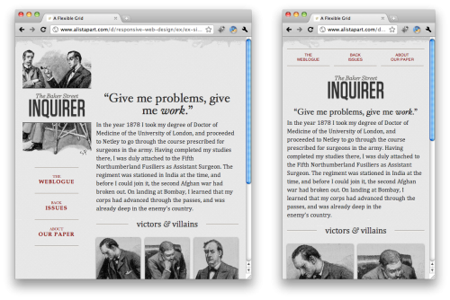
Take these two renderings of ‘The Baker Street Inquirer’, for example:

In the narrower example on the right, the title decoration changes, the menu items rise to the top of the page, the images appear in twos instead of threes, and so on.
This looks fantastic. Apart from being a lovely piece of graphic design, viewers also know that this page will look good in their desktop browser whichever size they have it set at, and they won’t have to risk lots of empty space on each side (on a too-large window), or lots of left-to-right scrolling (on a too-narrow window) – both concerns when a browser’s viewport doesn’t match a web designer’s assumption.
Six months on, the fruits of this article are starting to ripen. The good, the great, and the brilliant of the web design world obviously read it and took every word of it to heart. Two oft-discussed examples are Simon Collison’s and dConstruct 2010’s web sites: narrow your browser window on both to see the magic happen.
More recently, Jeremy Keith is notably flying the responsive flag, and has designed a number of sites (and redesigned his own) using a similar approach. Just last week, the mighty Happy Cog launched a very attractive new blog that narrows elegantly, and the talented Mike Kus (with Think Vitamin‘s redesign) has also joined the party.
So, the wheels of evolution turn. Designers are innovating, trying each other’s new techniques, and pushing this worthy idea onwards. They are influencing each other, and in the way these things cascade through imitation, influencing the approach that many thousands of developers who look up to them will take when next asked to design or redesign a site. At this rate, it will only be a few years before more web sites use media queries than don’t. It’s a smart solution, using well-known, standards-based technology, and users with different screens the world over will undoubtedly be happier.
Sadly, this technique is not the revelational panacea that some might present it as. While it copes well with the challenges presented by size-diverse browsers on a desktop, for example, it is flawed when presented as an single solution to the challenge of the mobile web. A more-or-less explicit tenet of the ‘Responsive Web Design’ school is that contemporary mobile browsers are served neatly by this technique, so it deserves to be put under this scrutiny.
Before we go any further, and for the avoidance of doubt, it is thrilling that the ‘mobile web’ has finally garnered some sort of interest amongst the web design community. For a decade, lonely pioneers have been hacking about with little more than monochromatic text on cramped and feeble browsers. Seeing a new wave of talented web artists thinking about the medium is very inspiring – spurred on by the rise and rise of brilliantly capable mobile browsers. Mobile, the historically gloomy little corner of the web, is ripe to welcome fresh and smart ideas – clever and efficient ways to deliver exciting content to mobile users.
Sadly ‘Responsive Web Design’ is not yet one of them.
To start off with, there are some technical and tactical issues. Experienced mobile web designer Bryan Rieger has most notably illustrated these concerns, and strategist Jason Grigsby has explored similar points. Their main concerns stem from the facts that:
- Media queries only affect the styling once the markup and other resources have reached the browser. Whatever the device – whatever the network it’s connected to – the browser will download the entire markup of the page, and any (probably large) images in it. Yes, a ‘responsive stylesheet’ can resize media or hide it from the user, but designers should not presume that they’ve done anything to improve the performance or network utilisation by this sleight of hand. Cellular network usage is free in neither the financial nor performance sense. Ironically, Mr Keith’s article about the technique itself has a total size of about 1.6Mb – a payload that no mobile device this side of LTE will sniff at.
- Media queries are not supported by most of the world’s web browsers. Certainly all WebKit-based browsers handle them well enough, and most other contemporary desktop browsers do too. But anything else will struggle: this includes legacy desktop browsers (which certainly don’t seem to concern the web’s great and good) and, more seriously, most mobile handsets in the market today.
Both issues are present in Mr Marcotte’s initial expression of ‘Responsive Web Design’. Perhaps understandably: while the exposition of technique focusses on the aesthetic of flexible design, there is little discussion of performance optimization. Further, many of these concerns pale if you’re a designer who lives in a world where everyone has an iPhone 4. Perhaps the article set out to merely present a prototype which the author knew would of course be iterated upon and refined.
Certainly some refinement could be applied to the mathematics, which apparently advocates daft rules like {margin-right: 3.317535545023696682%}!
But thankfully none of these concepts are necessarily deal-breakers: tinySrc (created by this author) allows you to have already dynamically-resized images arriving at the browser in response to a static piece of markup. Mr Reiger illustrates that by rethinking the assumptions about which browser is the default (i.e. a basic mobile one) and which receives the conditional styling (i.e. the clever, or desktop ones), one can mitigate a lot of the problems caused by serving up too many irrelevant resources. That’s probably not entirely what Luke Wroblewski was getting at when he said ‘Mobile First‘, but it’s good enough to work.
Hopefully, Messrs Marcotte, Keith, Kus, Zeldman et al will take these considerations on board and refine their logic accordingly. Theirs is the work that will be widely aspired to and derived from, and this is some basic hygiene that should be encouraged as soon as possible. The practices are not yet best practices – and we should hope that this technique doesn’t become a precedent for playing fast and loose with mobile payloads.
Technical issues aside, the primary concern with using ‘Responsive Web Design’ for mobile web sites remains, and it is far more fundamental.
Firstly let’s look at the name – or at least the origin from which is was purloined. ‘Responsive Architecture’, a term coined by Nicholas Negroponte, is a school of thought that says that buildings and structures should be able to react to changes in their environment, altering their shape or surfaces accordingly. Indeed this is what ‘Responsive Web Design’ does too: change the browser size, and the site within it will respond.
But Mr Marcotte posits that it is also about ‘how physical spaces can respond to the presence of people passing through them’ – in other words, that buildings should react to the way in which humans behave, and implicitly, to what it is that they need or want. This is where the ‘Responsive Web Design’ aspiration falls flat. Nothing about the technique is explicitly related to the human actually using the site, nor his or her context.
The problem of course, stems from the reliance on media queries as the key input to the layout’s alterations. Complex criteria can be built to segment styling based on width, height, orientation or color depth – but nothing else. The design is responding to the glass on the front of the gadget that the user has in their hand – not to the flesh and bone beyond it, where they are, what they are doing, and what state of mind they are in.
In the world of mobile, this matters. The fact that the user has a small screen in their hand is one thing – the fact that it is in their hand at all is another. The fact that the user may be walking, driving, or lounging is yet another. In fact, it’s quite likely that they really deserve different content and services altogether – or, at least, a differently prioritized version of the default desktop experience.
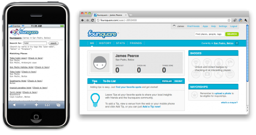
Is this too abstract? Too theoretical? Absolutely not. As a commonplace example, consider the FourSquare mobile web site and its sister web site. The former, of course, is designed as a slick and efficient way to check your location in to the service – and not much else. The latter provides a chance to review previous activity in the comfort of a desktop environment.

Is this responsive? Of course it is – at least in terms of responding to what humans in different environments want to do. The user, by specifying which site they want to receive, gets a design and an interface that is wholly appropriate to their context, not just their screen width. (Sadly, visitors with mobile handsets do not get automatically forwarded to the mobile version of the site, which would have made the service even more ‘responsive’.)
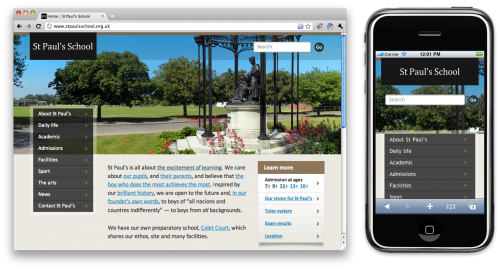
Consider, on the other hand, the St Paul’s School website. It looks lovely and exhibits all the hallmarks of the ‘Responsive Web Design’ school. Resizing the browser window demonstrates the page’s fluid grid, and on a narrow, mobile screen the layout becomes vertical and flows respectably down the page.

But let us just think about the use cases for this web site. Clearly the desktop site is designed to target prospective parents – St Paul’s is a top-notch fee-paying school in London – and the design, menu structure and layout reflect that. The ‘about’ page is first and foremost in the menu, followed by a sequence of pages designed to give the reader an insight into the workings and philosophy of the school. One can imagine well-heeled parents poring over the site for hours, deciding if it is the place for their child to attend and getting a feeling for the institution.
But a mobile user? Let us think about what a mobile user might want from their interaction with the school’s online presence. Are prospective parents so busy that they research making one of the biggest investments in their lives by spending a few moments on a mobile browser? Well, possibly; but it is hard to imagine that reading the school’s lengthy prospectus should top of the list of important mobile use-cases.
If one is accessing this site on a mobile device, there are other far more likely reasons. Imagine an existing parent or student keeping abreast of the (well-populated) school news, or upcoming calendar of events. This is something they might easily snatch a few moments doing in the car on the school commute, say. Or perhaps the user is a prospective parent or visitor who wants to check on the address and location of the school en route, or wants to put a call through to the school office.
Has the design responded to these, now very different, requirements? No. In the mobile display of the site, the news and contact pages are still at the bottom of the menu, below the admissions information and exhaustive list of school sports. The contact page (once you have reached it) does contain telephone numbers, but they have been turned into callable links by the browser’s automatic number detection, not the designer’s hand, so rather curiously you can also click to call the school’s fax number.
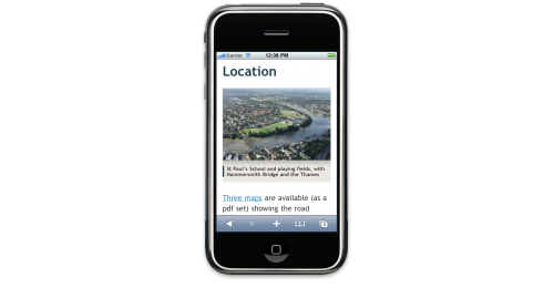
And the location page, to get a map and directions to the school? Most of the screen is taken up with an aerial portrait of the school – of arguably marginal help for navigation – and the map itself is only available within a 1.5Mb, three-part PDF document. You couldn’t make this up.

Surely a mobile user deserves and expects a map image embedded in the page, or even a link to Google Maps (which, incidentally, certain mobile browsers will parse to invoke the native map client). Apparently a few of these clever new gadgets have GPS in them.
Responsive to the user’s needs? Barely.
Anyway, the purpose of this article is not a hatchet attack on one particular site. It’s merely being used as an example of how using what is currently called ‘Responsive Web Design’ is often nothing of the sort – or, at best, a single cosmetic tool that needs to be used in conjunction with other, mobile-centric ideas and sympathies.
One gets the sense that those promoting and using ‘Responsive Web Design’ in its current form secretly hope that this is all they will have to do to be able to call their sites ‘mobile-ready’ (although whether that is what they commit to their clients, of course, one cannot say). We should sincerely hope this is not the case. These are smart and insightful individuals: surely they understand that juggling a few pixels around does not amount to designing for different types of user.
Mr Keith in particular appears to understand the dilemma. He points out that ‘I don’t refer to this as mobile optimisation’ and that media queries are not the ‘silver bullet for the mobile context’. Nevertheless, the screenshots of his portfolio sites are 480px in width (conveniently the landscape size of an iPhone), and he is somewhat disparaging about the idea of ‘the rabbit hole’ of creating a different site for mobile devices.
(Of course that isn’t technically required. A small snippet of server logic would have have been all that was required by St Paul’s to move news and contact to the top of a mobile menu, and to replace the PDF link with a Google Maps resource, for example.)
But this may give us a clue why so many others seem desperate to will the current implementation of ‘Responsive Web Design’ into being as the sole way to develop services for mobile users: it’s all client-side, and requires nothing more complex than a few extra tricks in existing CSS files. It may be that many web designers are daunted by the thought that they may be required to think about mobile device detection and conditional logic on the server-side, and are clinging to the hope that they can claim to support mobile users without having to do any, well, programming.
Sadly for those involved, this probably can’t be avoided. It’s not that media queries aren’t an excellent way to resize layouts (of course they are), nor that they don’t act as a reasonable proxy for identifying a mobile devices (which is also more or less true for now) and in turn mobile humans.
It’s a more fundamental issue – which is that any site should be ruthlessly scrutinized for ways in which it can behave in better ways for all of its constituencies of users, and that the differences between those ways are often going to be more significant than can be papered over with some stretchy images and fluid grids on a conveniently powerful mobile browser.
The real fear is that this subtlety is lost on those disciples who want to rattle off a site design that works on mobile devices as well as desktop browsers. The result of their efforts might look lovely on the client’s iPhone, but the speed at which that magic trick was performed will certainly have come at the expense of someone actually sitting down and thinking about what that mobile variant of the experience should actually offer.
The result? We won’t have a mobile web, but merely a 320px-wide one. A web for which the humans using it matter less than the width of the glass it is displayed on.
As a postscript, an analogy: we are in an age which, in many ways, resembles that of the birth of broadcast television. The mobile web is a new medium that, yes, is able to deliver services similar to its precursor, but which can also be developed and enhanced in ways that have yet to be dreamt of. Reflowing today’s web sites for mobile devices is a philosophy akin to that of the first broadcast television programs: “let’s stick with what worked before, and just put well-dressed radio presenters onto the screen”.
Did that work? Sure it did – as a start. But was it these dull talking heads that made television the greatest medium of the 20th century? Hardly. It was when program makers started to explore the visual capabilities of the their new canvas – and the increasingly demanding expectations of the viewers who expected to see something more interesting on the wooden box they had just spent a lot of money on – that innovation occurred.
Today’s ‘Responsive Web Design’ is a lukewarm response to a similar seismic shift – that of the sedentary web into expectant mobile hands.
Our approaches need to be bolder, more structural, more experimental, and, frankly, more considerate of the diverse audiences we should all be trying to cater for.